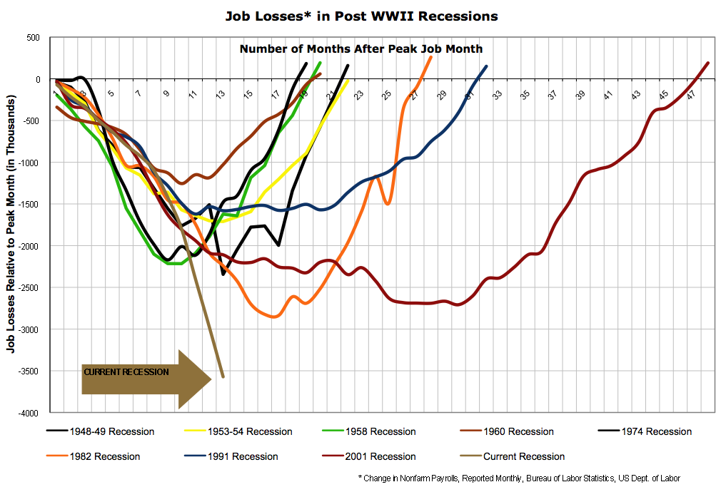
Here is a depressing graph to ponder. It is fairly self-explanatory, the graph shows all of the post-WW2 recessions, and the relative job losses suffered as a result of each. The job losses are determined by charting the decline in jobs during each recession compared with the period immediately following the individual recession.
As you can see, our current economic downturn is so much worse than anything we have seen since World War 2, the line is basically in free fall.

.jpg)


2 comments:
Certainly these numbers could be absolutely correct. However, I have to point out that the collection of data before 1980 can be considered seriously suspect for two reasons. One the collection of data was taken from biased sources (In this case politicians trying to increase the moral of the population) and second the collecting techniques were simply less exact. Not to mention we have no idea how modern statistics have been altered by biased parties involved. Though, like i said it could all be true... just like WMD's let's keep our heads cool before flipping out and making the economy ten times worse than this recession has to be.
Holy crap. I guess Clay should become a firefighter.
Post a Comment